Eat Beer Biotech
Brand System & Website
2024
We brew the future!
EAT BEER Biotech is a food tech start-up that turns brewers’ spent grain, the main by-product of brewing, into a protein raw material for food. It is a strong idea with a hard problem: biotech processes are difficult to explain and easy to distrust.
We built a brand that makes biotech feel close to beer. A brewing tank with an ear of grain became the sign, a technical line language carries the icons, and a process diagram explains the whole journey from spent grain to protein in one look. The system runs through the guidelines, investor decks, social media and a modular website.


The Brief
From waste to raw material.
Breweries produce large amounts of spent grain, and most of it ends up as animal feed or waste. EAT BEER Biotech has a process to extract protein from it. Investors, breweries and food producers all needed to understand that process quickly and trust it.
The brand had to be credible enough for a science and investor audience and still feel like it comes from a brewery, not a lab. Above all, it had to explain.


The Idea
Show the process.
Instead of hiding the technology behind lifestyle images, the brand shows it. The logo is a brewing tank, the starting point of every beer. It carries an ear of grain, and the dots stand for the proteins extracted later in the process. A molecule grid becomes the pattern, and the icon set is drawn in one technical line. Out of these parts we built a process diagram that tells the story in a few steps and works in decks, on the website and in print.

The System
Line, grid and one blue.
Sign
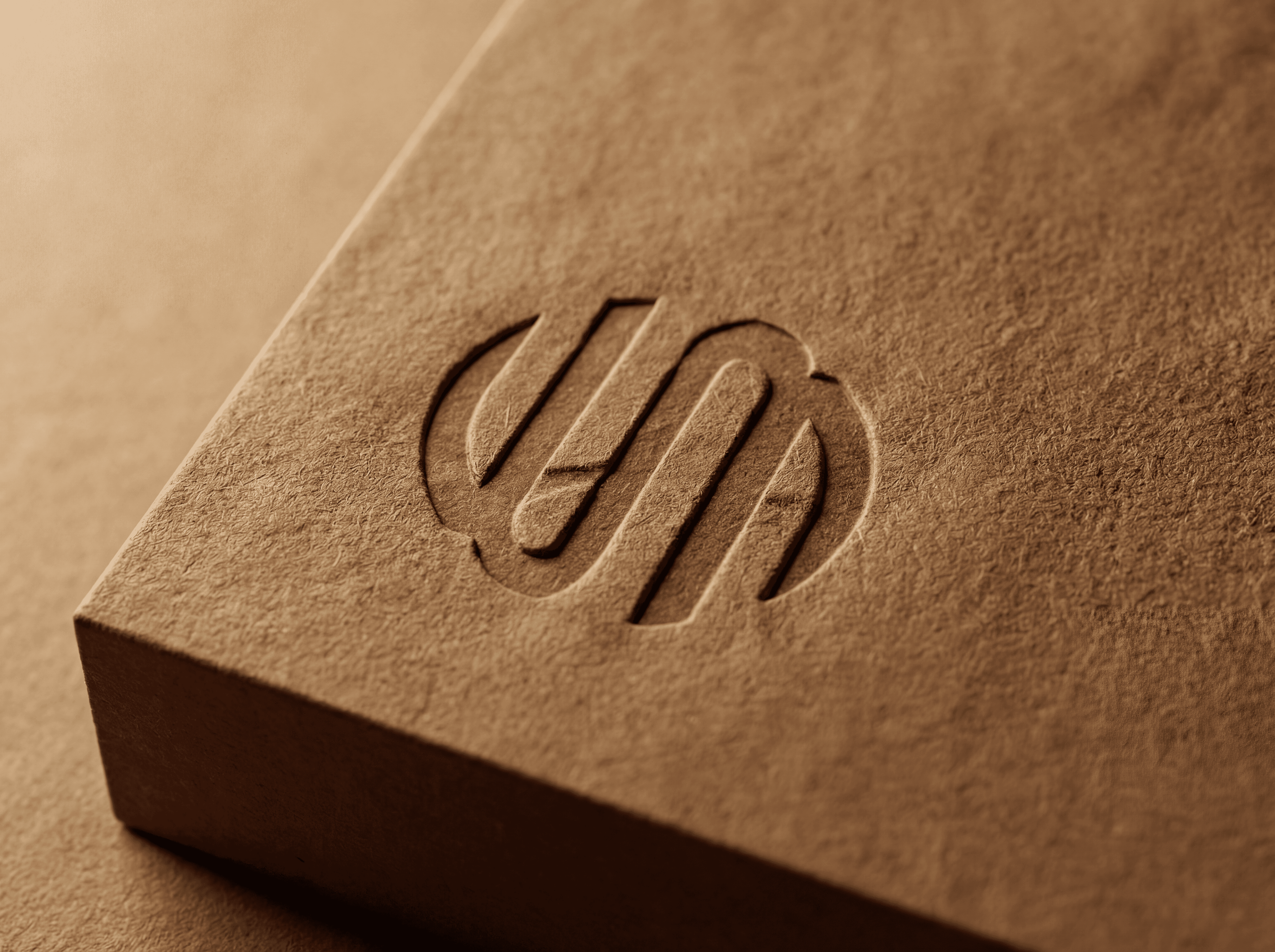
A brewing tank with an ear of grain and protein dots, a mark that connects beer, raw material and science in one shape.
Colour and type
Anthracite and grey as the base with one clear blue as the signal, set in DIN 2014 for a technical, trustworthy voice.
Process diagram
From spent grain to protein in a few steps, built from the icon set and used as an explainer in pitches, on the website and on social.


The Result
One system from investor deck to website.
EAT BEER Biotech now explains itself in one look. The process diagram anchors pitches and the website, the guidelines keep every new piece consistent, and the claim We brew the future! links the science back to the brewing world it comes from. The website is built from modules, so the team can add news and partners as the company grows.

Credits
My role
Brand identity, information design and website UI/UX in the Wertmarke team
Client
EAT BEER Biotech
Alongside
Wertmarke Hamburg
Year
2024
Elsewhere