Störtebeker
Website & Shop Relaunch
2025
One brewery, three websites, one design system.
Störtebeker runs three websites. The brand site presents the full beer range, the online shop sells beer, spirits and merchandise, and the Brauquartier site brings visitors to the brewery in Stralsund for tours, the restaurant and the brewery market.
We redesigned all three on one shared design system, so every page feels like the same brand, from the stormy sea in the hero to the last step in the cart. The work covered page structure and UX, UI design for desktop, tablet and mobile, design tokens, a component library, shop and booking flows, and the handoff and design QA with the development team.


The Brief
Three websites that had grown apart.
Over the years the brand site, the shop and the Brauquartier had drifted into three different looks, built at different times by different people. Visitors moving from the story to the shop felt like they had changed company.
The relaunch had to bring them back under one flag without losing what each site has to do: tell the brand story, sell beer online and fill tables and tours in Stralsund. It also had to be maintainable, so new products and events could go live without a redesign.


The Idea
Auf zu Abenteuern, on every page.
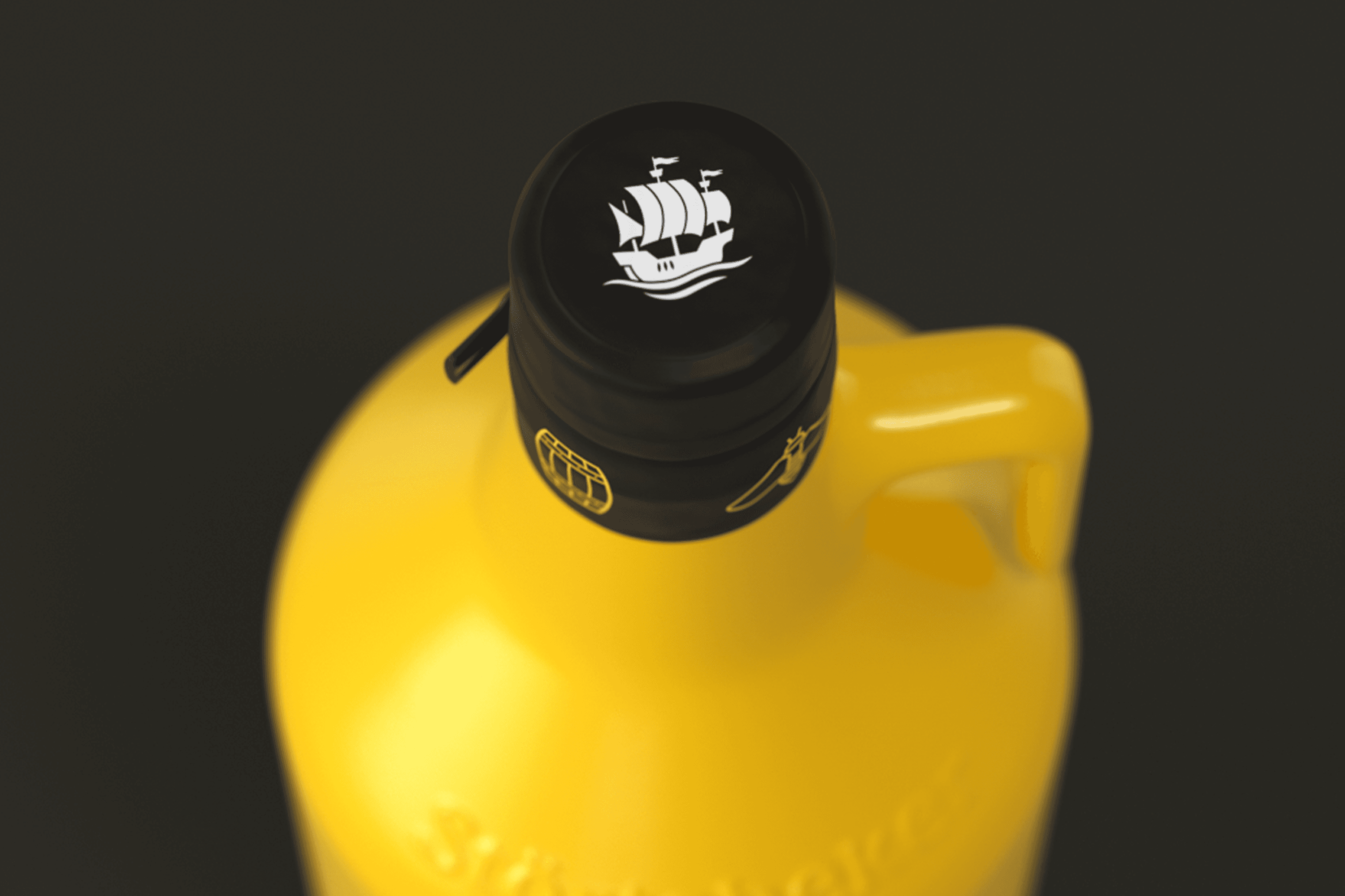
The brand claim Auf zu Abenteuern leads the way. Every site opens with large imagery, the vertical wordmark and the red flag, so the first second always feels like Störtebeker. Underneath, one set of tokens and components carries the brand through content, commerce and booking. A product card looks the same on the brand site and in the shop, and the booking tool for the Brauquartier uses the same buttons and forms as the cart. The adventure does not stop at checkout.
The System
One system, three jobs.
Design tokens
Colour, type, spacing and radius as one token set, with Störtebeker red as the brand anchor and anthracite as the stage for imagery.
Components
Buttons, product cards, filters, navigation, footer, mini cart and booking tool, designed once and reused across all three websites.
Breakpoints
Every template designed for desktop, tablet and mobile, with mobile treated as a first class layout because most visitors arrive on their phone.


The Result
Three websites that finally belong together.
The brand site, the online shop and the Brauquartier now share one design language and one component library. Developers build from a documented system instead of single screens, new products and events slot into existing templates, and visitors move from the story to the shop to a brewery tour without feeling a break in the brand.
Credits
My role
Lead designer: UX, web design and design system in the Wertmarke team
Client
Störtebeker Braumanufaktur, Stralsund
Alongside
Wertmarke Hamburg
Year
2025
Elsewhere