Hancock Craft Cider
Brand & Packaging
2025
Crafted in Hamburg. Inspired by Canada.
Hancock is a craft cider brewed in Hamburg with roots in Canada. The founder had a name, a family story and a recipe, but no brand yet. We built it from the name up: a sign, a landscape, a range of four flavours and the packaging that brings it all to the shelf.
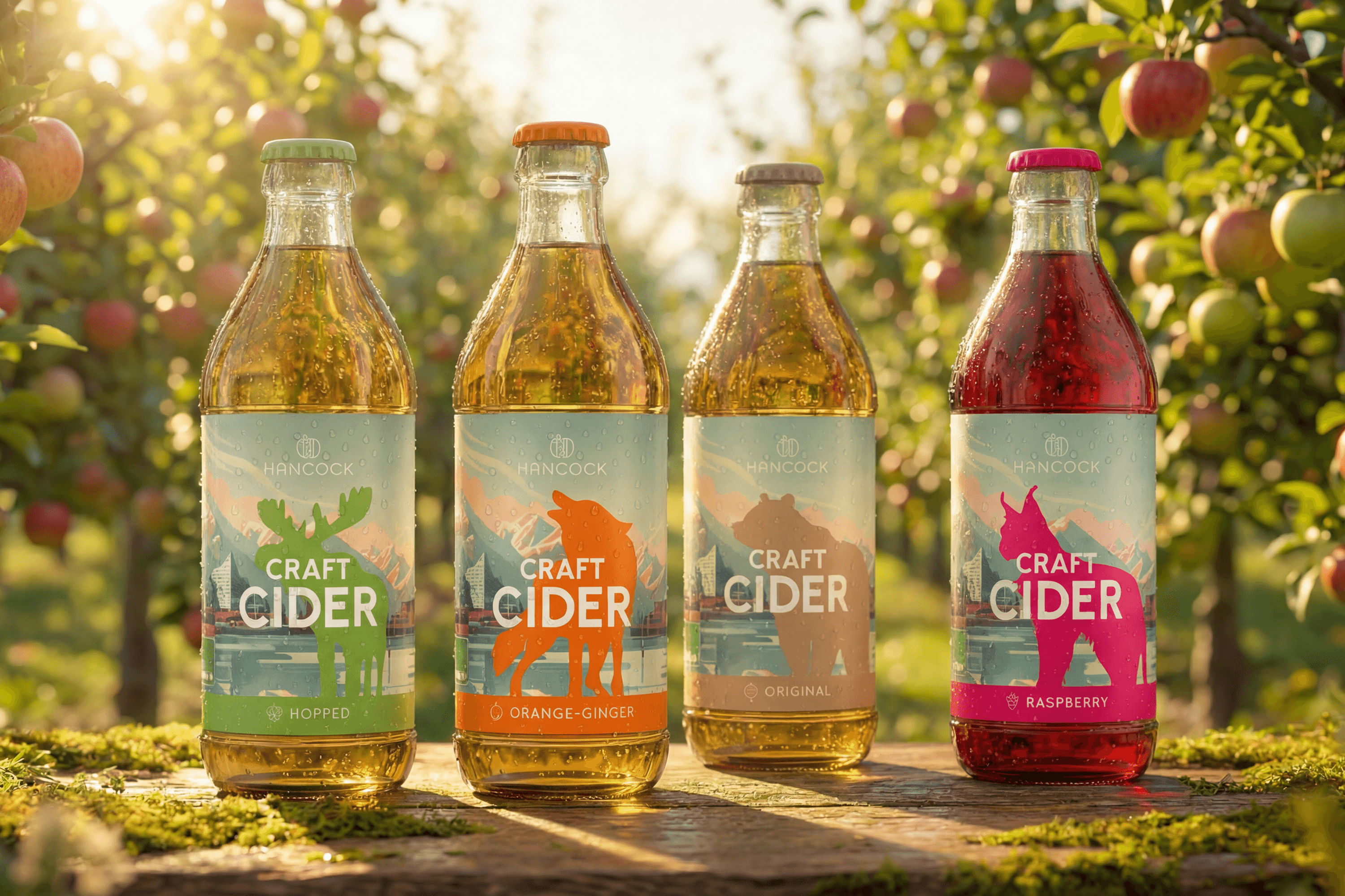
The brand identity combines a simple apple H, a Canadian mountain landscape and four animals, one for each flavour. Labels, the four-pack carrier and the vehicle branding all follow the same system, so the range reads as one family and every flavour is still easy to find.


The Brief
A cider without a story yet.
Craft drinks live on story. Buyers pay a premium when they feel there is a real person and a real place behind the bottle. Hancock had both, a founder in Hamburg and family roots in Canada, but none of it was visible yet.
The brand had to feel personal and handmade without looking homemade, carry the connection between Hamburg and Canada and justify a craft price next to big cider brands. It also had to work across a growing range of flavours.


The Idea
Four flavours, four animals.
One landscape carries the brand: a mountain lake that stands for the Canadian roots and appears on every label. Each flavour gets an animal from that landscape and a colour of its own. Ginger Orange gets the fox, Raspberry the lynx, Hopped the moose and Original the bear. On the shelf the four labels line up as a family, and the animal makes each flavour easy to remember and easy to ask for at the bar.

The System
A sign, a landscape, a family.
Sign
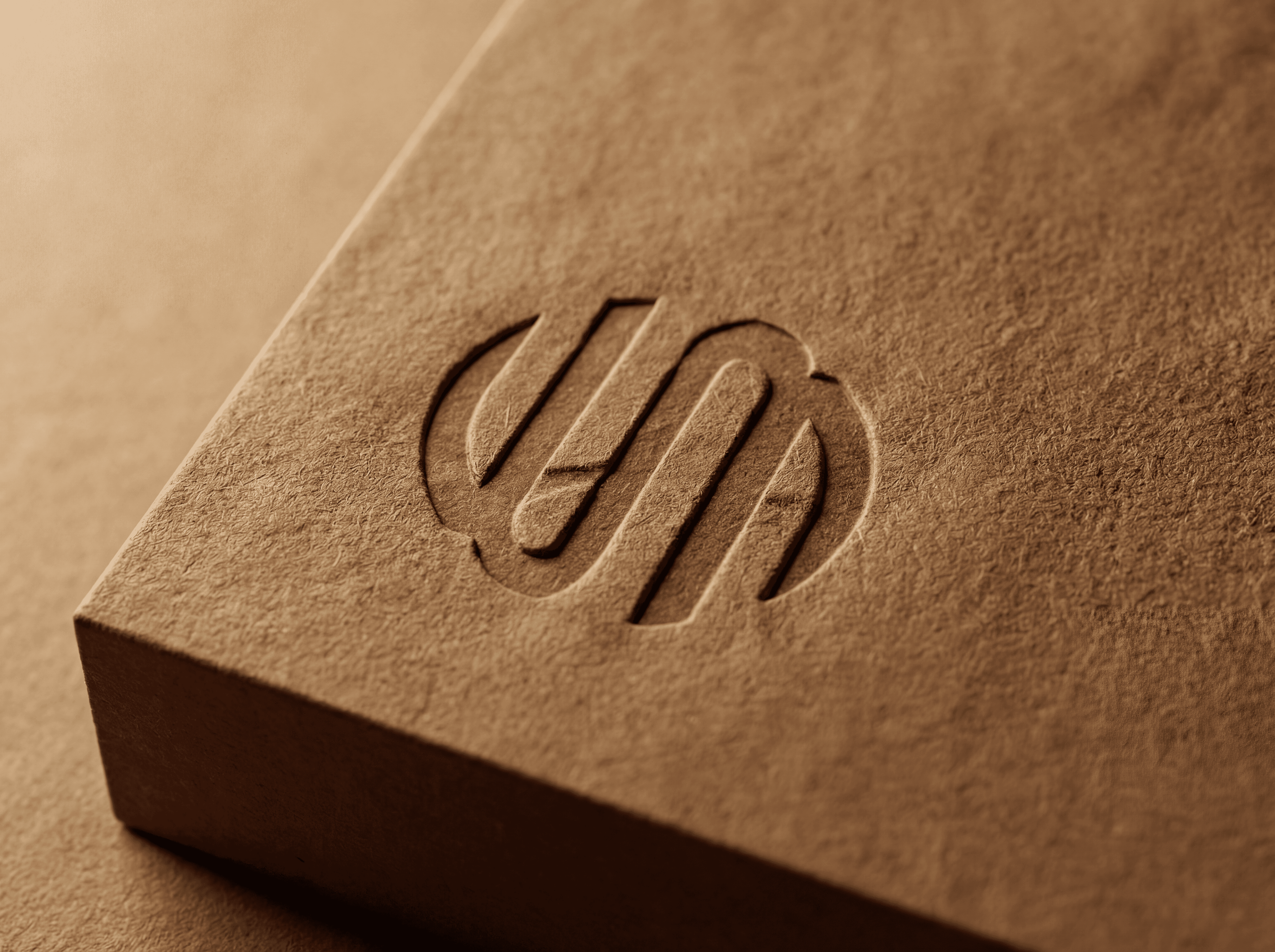
An H inside an apple, simple enough to work on a bottle cap, a sticker, a glass and the side of a van.
Colour and type
Petrol, off-white and grey for the brand, one strong colour per flavour. Grover for the logo, Market Pro for claim and sublogo, Urbanist for everything else.
Illustration
A mountain lake for Canada, four animals for the flavours and line icons for orange, raspberry, hops and apple, used on labels, carrier and social.


The Result
A range that reads as a family.
Hancock now has a complete brand: a sign, a story and four flavours that are clearly related and clearly different. Labels, carrier and vehicle branding follow the same system, and new flavours can join the family by adding a new animal and colour without redesigning the range.

Credits
My role
Brand identity and packaging in the Wertmarke team
Client
Hancock Craft Cider, Hamburg
Alongside
Wertmarke Hamburg
Year
2025
Elsewhere