The Icon League
Brand Identity & Guidelines
2024/25
One league. One brand language.
The Icon League is the creator-led football league founded by Toni Kroos and Elias Nerlich. Former professionals and the biggest creators in German football play together, and every matchday runs live on stream, in the arena and on social media.
A logo and a palette already existed, made before I joined, but without a clean construction, print values or rules anyone could follow. As brand and creative lead I reset the logo, developed the variants, turned the globe into a standalone element, corrected the palette for print and wrote the brand story and guidelines that every partner team worked from. A second designer delivered the final logo artwork under my direction.


The Brief
A brand that has to carry a league.
The league was run by three partners, each with its own team and suppliers: stream production, arena, social media, website, merchandise and sales. Every one of them needed the brand at once, and every one of them needed it to work in their medium.
The existing logo could not do that. Its construction was loose, the colours did not print correctly and there were no rules, so every supplier interpreted the brand in their own way. The league needed one brand language before it could look like one league.


The Idea
Reset, not redesign.
The audience already knew the logo, so a full redesign would have thrown away recognition the league had already built. Instead we kept what people knew and fixed everything underneath: a clean construction, a clear set of variants for every surface and one job for every element. The wordmark names the league, the trophy stands for the competition, the globe stands for the world of football and creators, and colour sets the energy. With that logic, any supplier can build a new application without guessing.

The System
Wordmark, trophy, globe.
Logo system
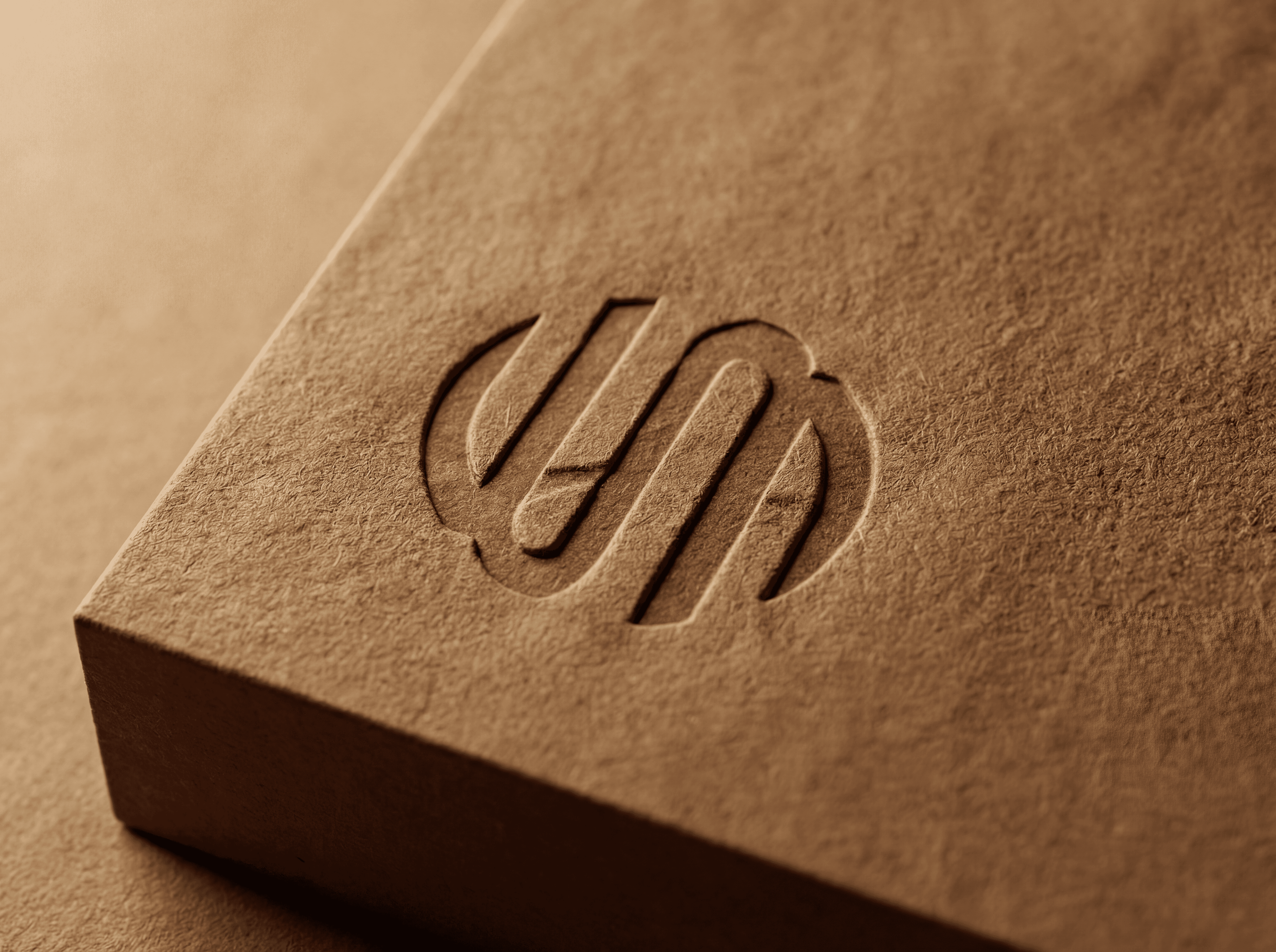
Composite, vertical and single marks in 1c and 4c, for dark and light surfaces, from a stream overlay to a stadium banner and a jersey patch.
Colour
Magenta, blue and pink with full shade ramps and corrected print values, so the brand looks the same on LED walls, merchandise and paper.
Guidelines
One brand manual for every partner and supplier: logo, colour, type, backgrounds, team crests and applications, with clear dos and don’ts.


The Result
One brand across stream, arena and social.
With the reset and the guidelines in place, stream graphics, arena branding, social content, partner decks and merchandise all came from the same source. Suppliers worked from one manual instead of screenshots, and the league looked like one league wherever fans met it. The brand became the base for the venue branding, the social content system and the sponsorship decks shown in the related cases.

Credits
My role
Brand and creative lead: creative direction, logo reset, variants, globe element, palette and guidelines. In-house via Rabona. Final logo artwork by a second graphic designer.
Client
The Icon League
Alongside
Rabona · 360 Media · TwoSides
Year
2024/25
Elsewhere