Kirsten Schlömer
Personal Brand
2023
A personal brand that feels like the first session.
Dr. Kirsten Schlömer is a coach in Hamburg. She works with people on three things that rarely stay separate: their life, their business and their health. Some clients come to her as private individuals, others as founders and leaders, and many arrive with a mix of all three.
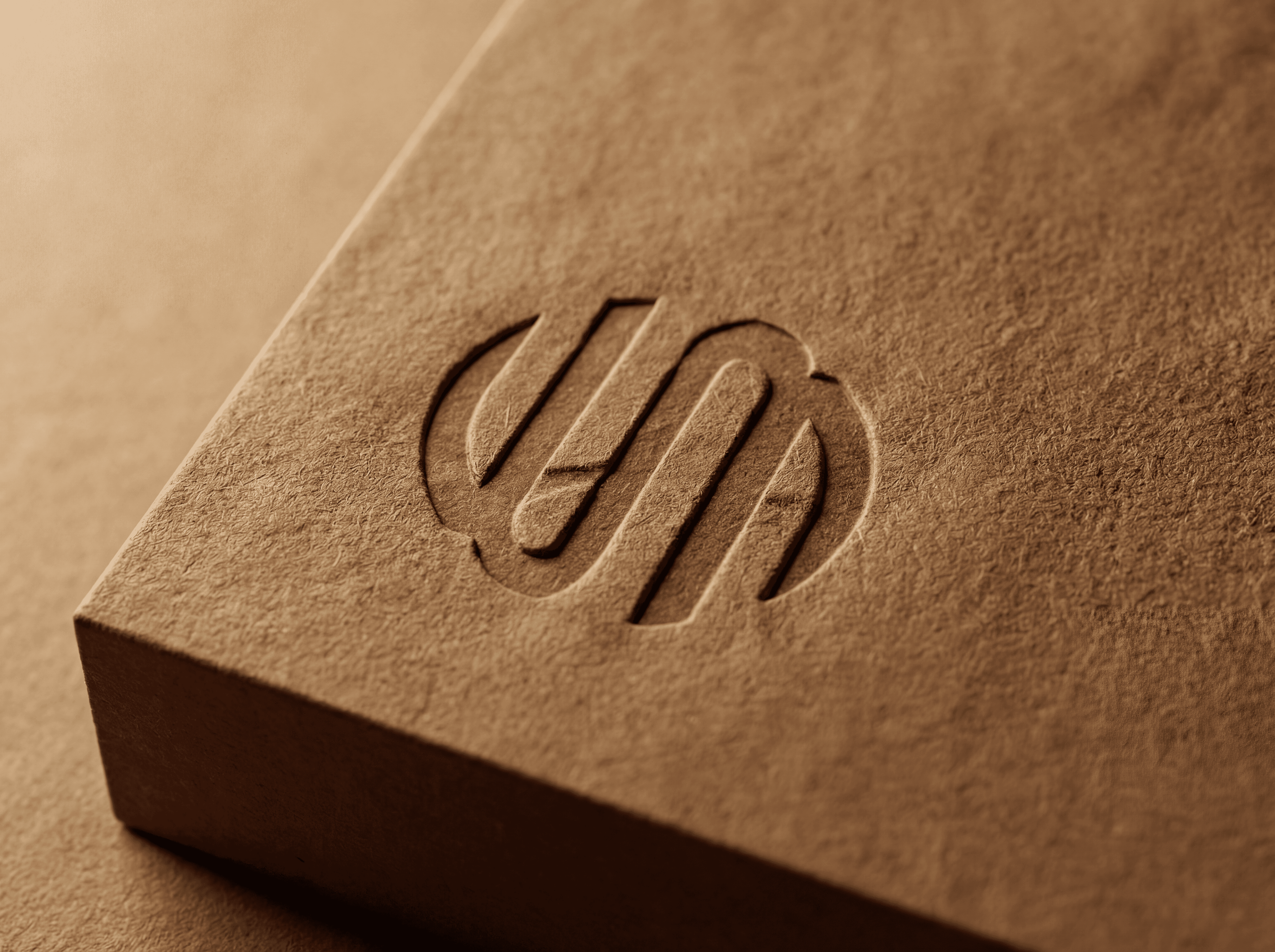
Her personal brand had to hold that range without splitting into three offers. We built it around her as a person: a KS monogram drawn in one continuous line, a leaf as a second sign for growth and health, a calm colour palette and a handwritten voice. From business cards and letterhead to presentations, Instagram and the website, every touchpoint now feels as clear and warm as a conversation with her.


The Brief
Three fields of coaching, one person.
Coaching is a trust business. People book a coach because they feel understood before the first session even starts, and a personal brand either builds that feeling or gets in its way. For Kirsten the challenge was range: life coaching needs warmth and closeness, business coaching needs credibility with leaders, and health coaching needs calm and care.
Presented as three separate offers, the practice would have looked scattered. Presented with a generic coaching look, it would have looked like everyone else. The brand had to make her recognisable as one person with one way of working, and still give each field a place where clients can find what they came for.


The Idea
One line, one leaf, one person.
The monogram is the core. K and S are drawn as one uninterrupted line, the way a good conversation keeps going without breaks. It works as a signature, as an avatar and as a quiet mark on print. Next to it sits the leaf, a simple line drawing that stands for growth, health and balance and gives the brand a second, softer sign for social and editorial use. Three small icons mark life, business and health, so the fields stay visible without becoming separate brands. Everything is drawn in the same thin line, which keeps the identity light and personal instead of corporate.
The System
Monogram, leaf and a calm palette.
Monogram
K and S drawn as one continuous line with rounded ends. It scales from a favicon to a printed letterhead and works as the main logo, as a profile picture and as a signature on documents and slides.
Colour
Six calm tones, from a deep sage teal for the brand frame to soft mint and rosé for backgrounds. The palette feels natural without looking like wellness clichés and keeps enough contrast for text and screens.
Type and voice
Korolev Condensed in Thin and Light for headlines and body, plus Quickpen as a handwritten accent for quotes and personal notes. Together they read like a professional practice with a personal signature.


The Result
A coaching practice that looks like its promise.
Kirsten now has one personal brand for every channel. The same monogram, leaf and colours run through her business cards, letterhead, flyers, presentation slides, Instagram templates and website, so a client who meets her online recognises her in person and the other way around. The system is simple enough for her to use day to day, from a new post to a workshop handout, without a designer for every piece.

Credits
My role
Brand identity, monogram, print and website UI in the Wertmarke team
Client
Dr. Kirsten Schlömer
Alongside
Wertmarke Hamburg
Year
2023
Elsewhere