Störtebeker Whisky & Honig Likör
Packaging, iF Design Award
2022
Whisky, reimagined as a honeycomb.
Störtebeker is a brewery and distillery from Stralsund on the Baltic coast. Its Whisky & Honig Likör blends whisky with regional honey, which already breaks with whisky tradition. A sweet whisky liqueur needs packaging that says so with confidence instead of hiding behind classic whisky codes.
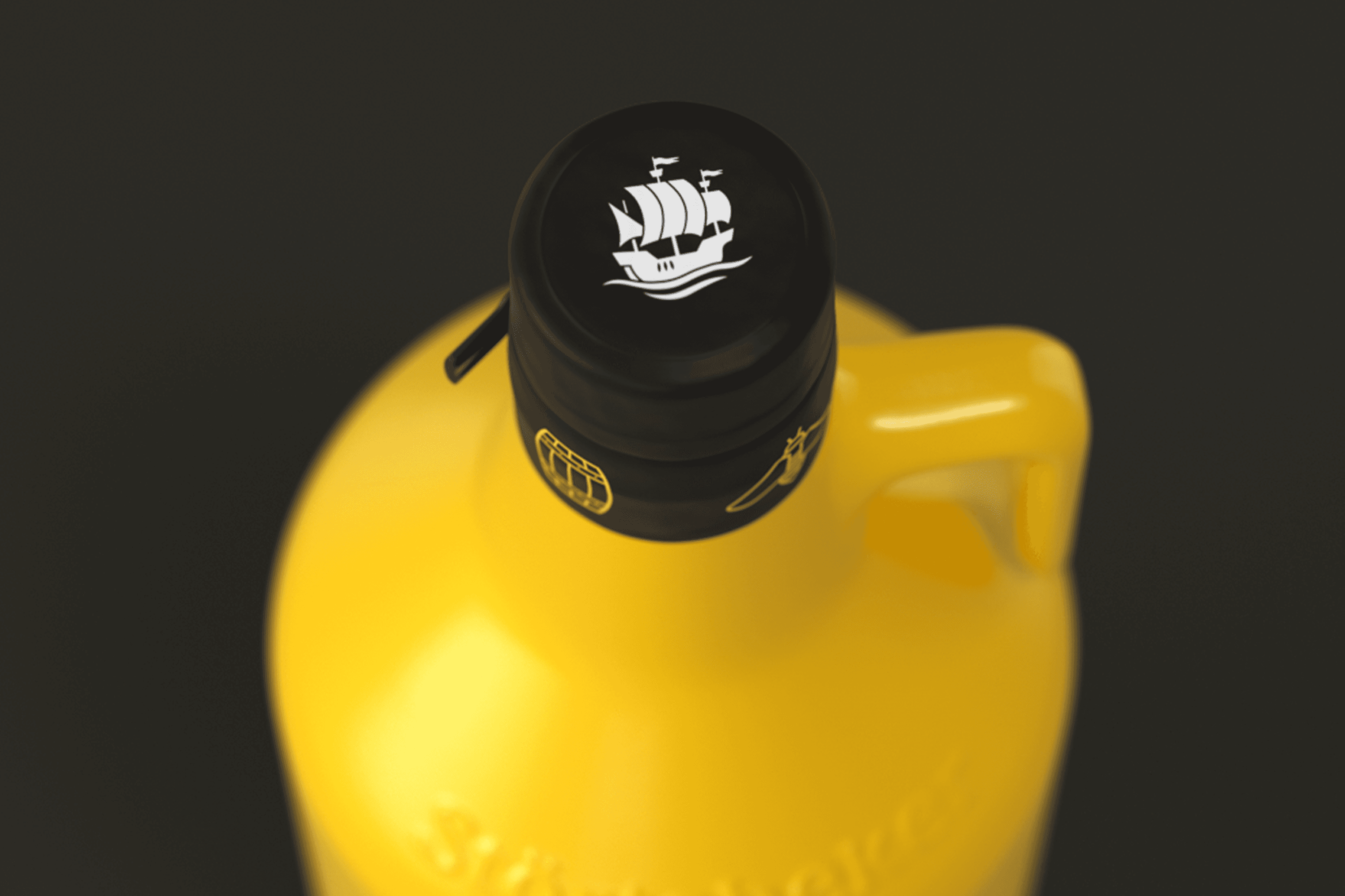
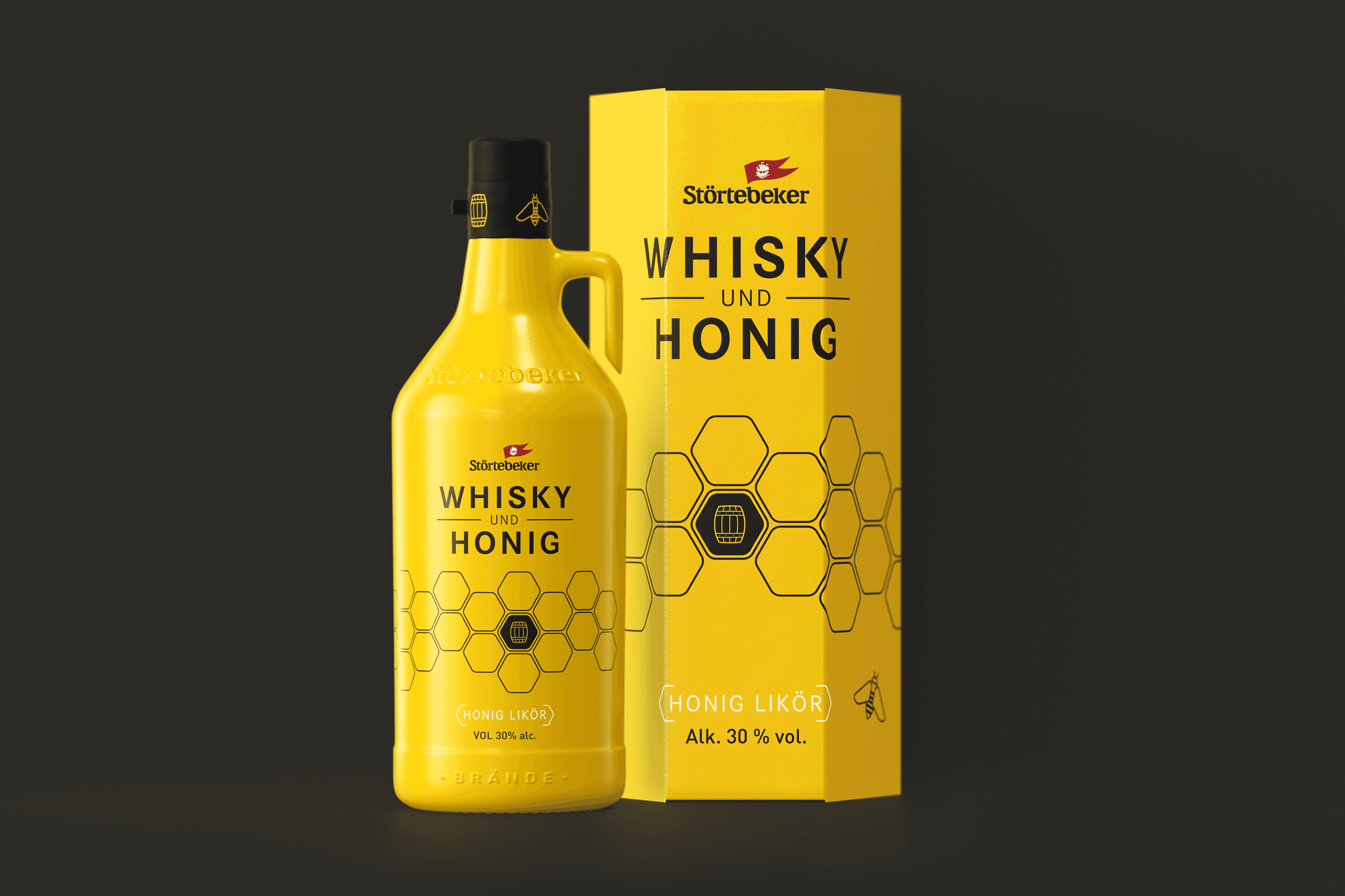
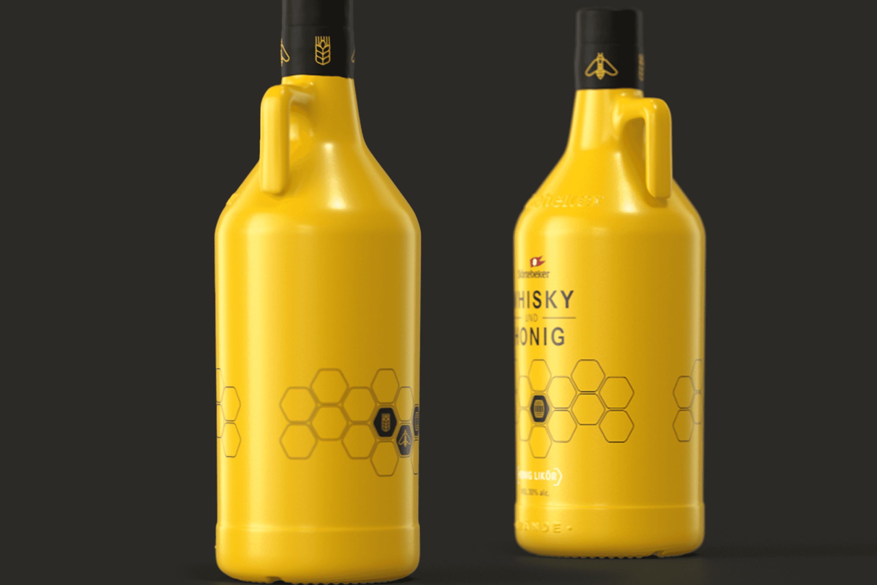
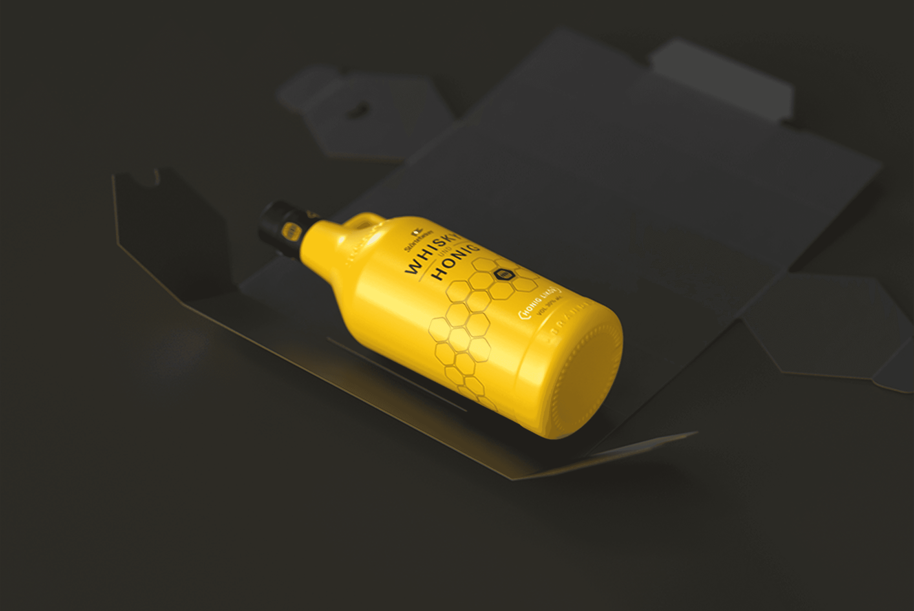
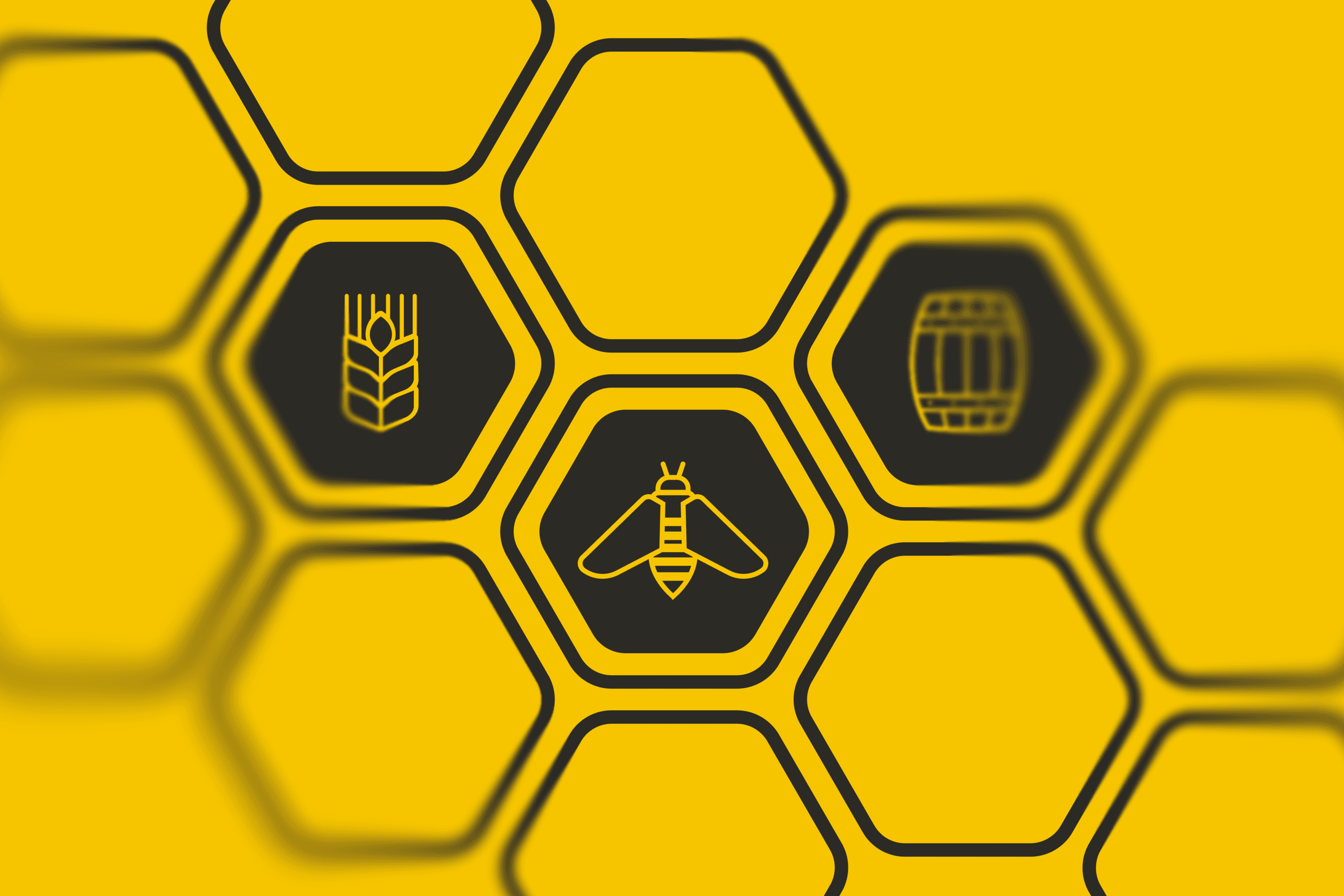
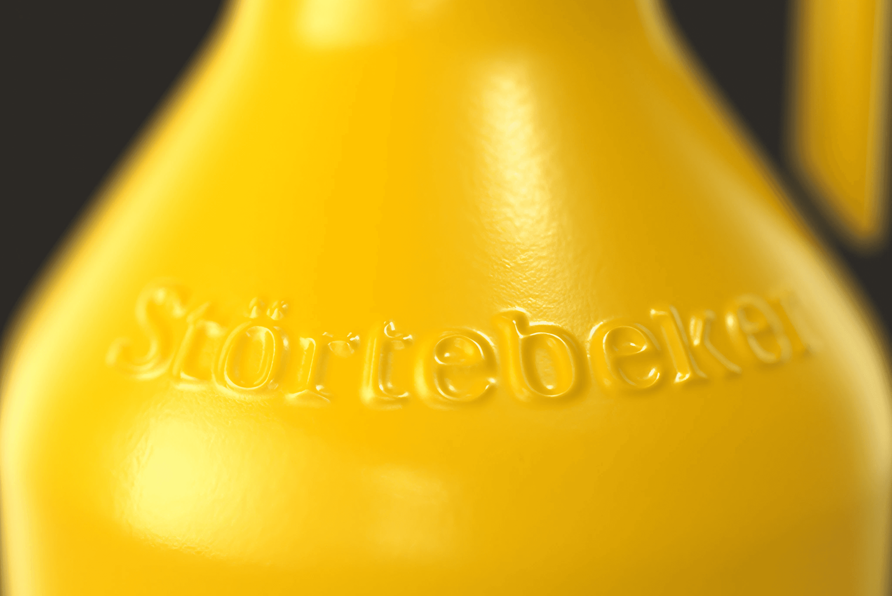
We designed a honey-yellow growler, a folding box shaped like a honeycomb cell and a small set of hand-drawn icons that tell the story of honey, barrel and bee. The packaging won the iF Design Award 2024.
The Brief
Sweet whisky, loud shelf.
A whisky liqueur with honey sits between two worlds. Dark labels, gold foil and heritage typography would make it look like any other whisky and hide what makes it different. Typical liqueur codes would make it look cheap next to the single malts it shares a shelf with.
The packaging needed its own place: premium enough for a gift, clear enough to explain the honey at a glance and strong enough to stand out in a spirits aisle full of brown and black.
The Idea
The honeycomb as the whole pack.
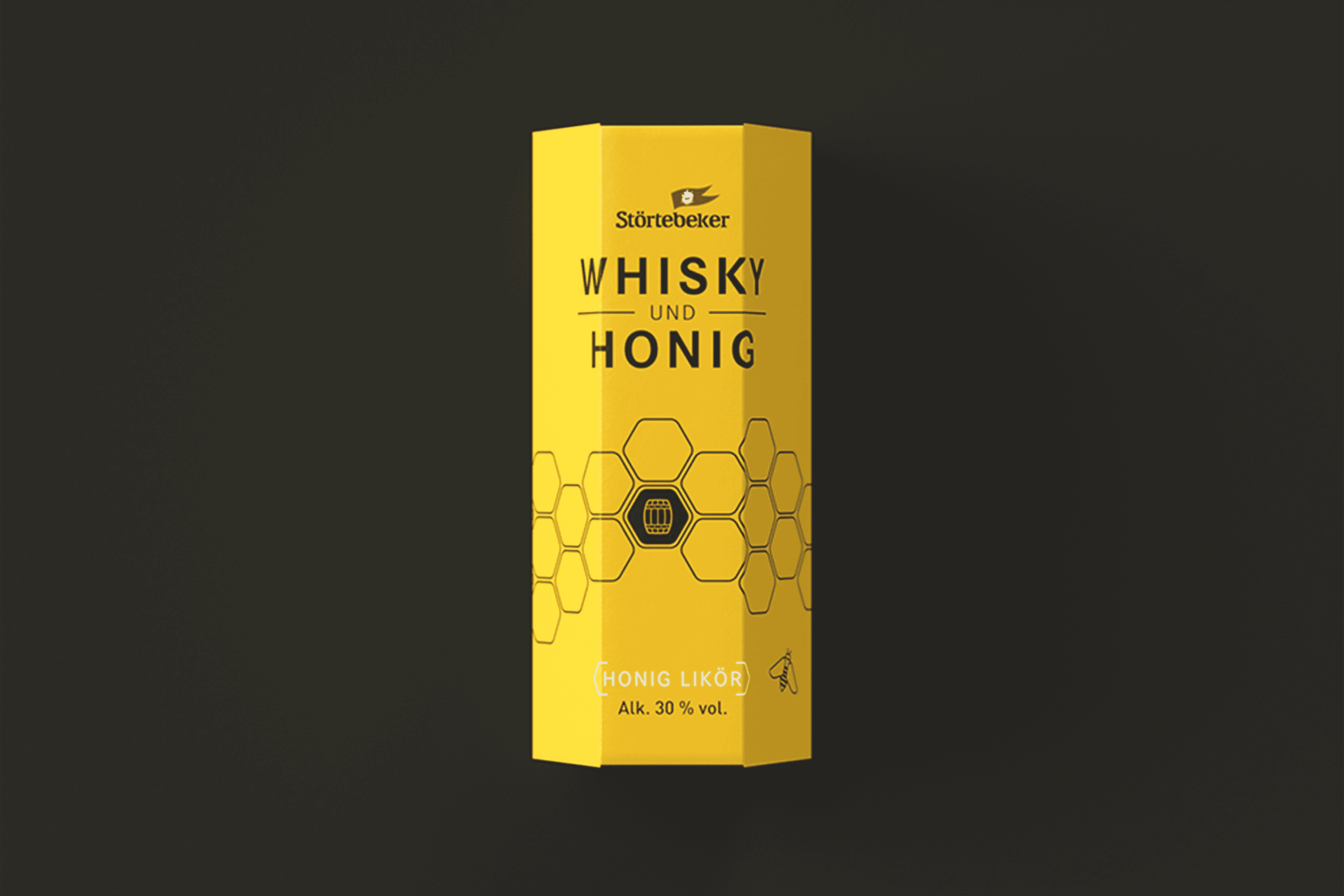
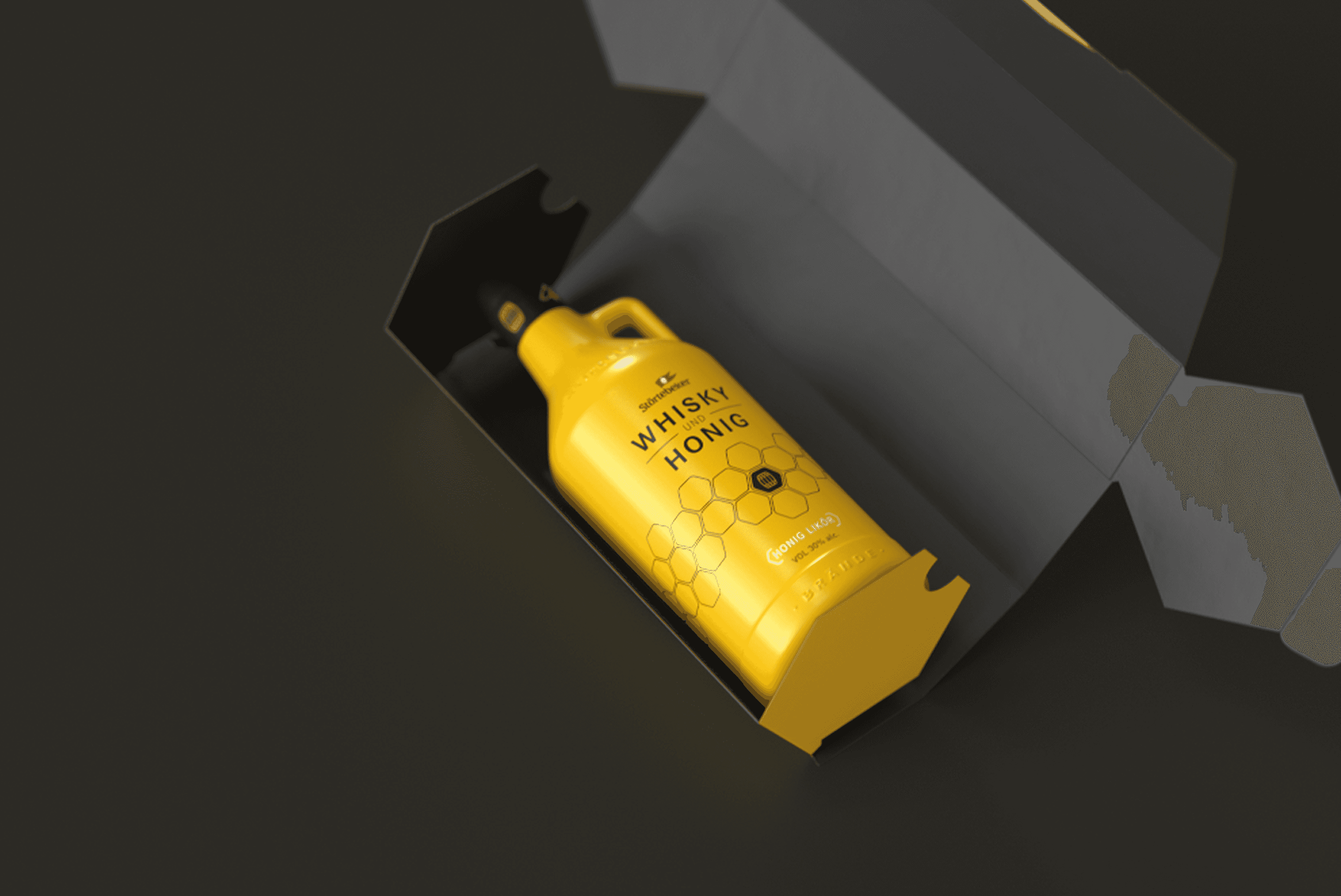
Everything follows the hexagon. The folding box is a honeycomb cell that protects the growler and stacks like a comb on the shelf. The label is built on a hexagonal grid, and the icons sit inside its cells. Honey yellow carries the product across the whole growler, while anthracite and black keep it a spirit. The idea is simple enough to read from across the shop and detailed enough to reward a closer look, from the embossed glass to the cap.
The System
One shape, one colour, one line.
Shape
A hexagonal folding box that protects the growler, works as a gift box and stacks like a honeycomb in retail displays.
Colour
Honey yellow for the whole growler, anthracite and black for type, cap and icons. The colour alone tells you what is inside.
Line icons
Thin line icons for bee, barrel and regional honey, drawn for this product and used on label, box and point of sale.

The Result
Winner, iF Design Award 2024.
The Whisky & Honig Likör packaging won the iF Design Award 2024, one of the most recognised international design awards. It gave a niche product a strong presence on the shelf and in the Störtebeker range, and showed how far a spirits brand can move away from category codes when one idea carries the whole pack.
Credits
My role
Packaging design and icons in the Wertmarke team
Client
Störtebeker Braumanufaktur, Stralsund
Alongside
Wertmarke Hamburg
Year
2022
Elsewhere