Wertmarke
Digital Relaunch
2025/26
An agency that finally looks like its work.
Wertmarke is a brand agency in Hamburg that has built identities for clients for more than twenty years. Its own brand had grown over that time and no longer matched the quality of the work it showed. The sign was heavy, the colours had multiplied and the website was hard to maintain and hard to find.
We reduced the brand to its essentials and carried that through every touchpoint: a cleaner wm sign, three colours, one typeface, a new website built in Framer, pages written for search engines and AI answers, a social media system and a logo animation that opens and closes every film. One system now runs from the letterhead to the website to the feed.


The Brief
The cobbler’s children.
Agencies are often the last to fix their own brand. Wertmarke had delivered hundreds of identities for clients, but its own sign was uneven in its curves, surrounded by too many colours and applied differently from one document to the next.
The website made it worse. It was difficult to update, it did not explain the services in a way search engines could understand and it was nearly invisible in AI answers, which is where more and more clients now start their search for an agency.


The Idea
Reduce to the sign.
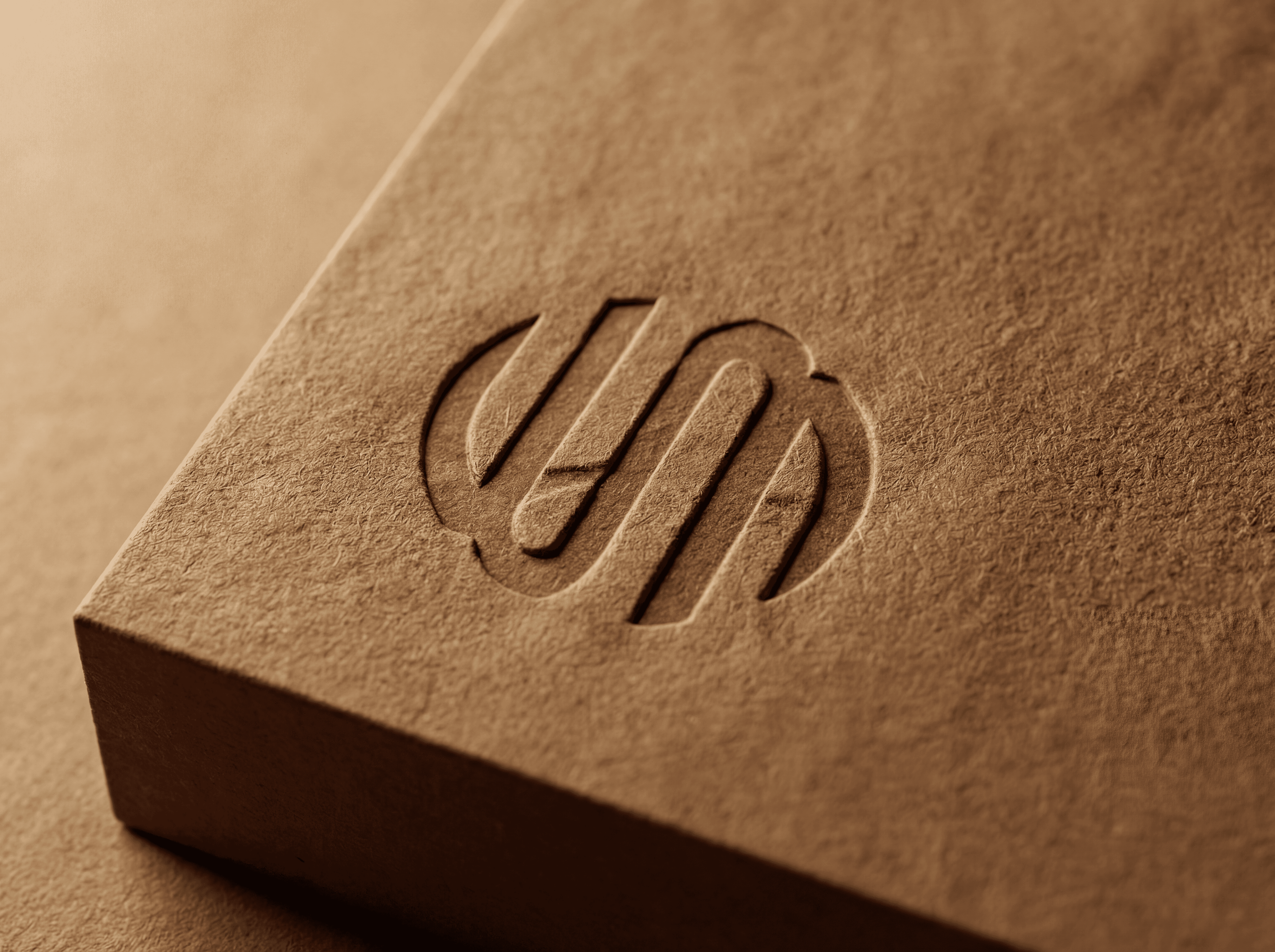
The wm sign carries the brand on its own. We redrew it with an equal stroke weight and a clean circle, removed the extra lockups and cut the palette down to anthracite, yellow and white. The yellow is recognisable at any size, from a favicon to a sign on the door. A wave line derived from the stroke of the sign became the divider that structures layouts in print, on the web and in social posts. The less the brand had to say about itself, the more room the client work had to speak.

The System
Three colours, one sign, one voice.
Sign and palette
Anthracite, yellow and white, nothing else. The redrawn sign works in every combination of the three, on paper, on screen and as a physical sign.
Type and wave
Outfit as the one typeface for everything, plus a wave divider taken from the stroke of the sign, used to separate content and give layouts rhythm.
Website and SEO
A Framer website with an expertise page per service, written for SEO and GEO, a PPWR packaging regulation page with a quick check tool and social templates for posts, carousels and reels.


The Result
One system, from letterhead to website to feed.
Wertmarke now presents itself the way it presents its clients: reduced, consistent and easy to recognise. The team can update the Framer website without a developer, each service has a page that can rank, and the social templates keep posts, carousels and reels in one look. A logo animation closes the system and runs as intro and outro across all channels.

Credits
My role
Designer in the Wertmarke core team: brand refinement, website design and Framer build, social system and animation
Client
Wertmarke Hamburg
Alongside
Wertmarke team Hamburg · LLAMA LEAGUE (tracking)
Year
2025/26
Elsewhere